
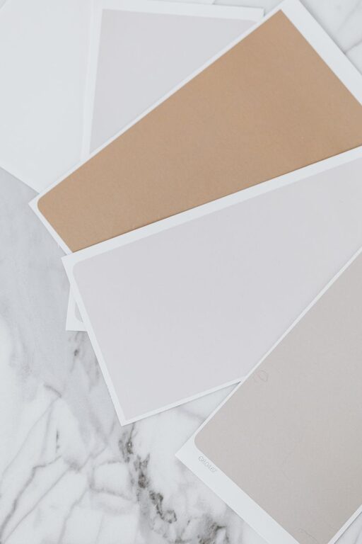
Creating a calm and peaceful environment at home starts with the colors you choose for your walls, furniture, and accessories. Calm colors help reduce stress, promote relaxation, and make your living spaces feel more inviting. But with so many options available, how do you pick the right hues to achieve that tranquil vibe?
In this post, we’ll explore practical tips for choosing calm colors for your home, explain why certain colors work well, and share ideas to help you create a soothing sanctuary.
Why Choose Calm Colors?
Colors influence our mood and emotions more than we might realize. Bright, bold colors like reds and oranges can energize and excite, which is perfect for some spaces but not ideal if you want to unwind. Calm colors tend to be softer, muted, or cooler tones that help reduce tension and create a sense of harmony.
Some of the benefits of using calm colors in your home include:
– Lower stress and anxiety levels
– Improved focus and mental clarity
– A welcoming atmosphere for guests
– Enhanced feelings of comfort and safety
Keeping these benefits in mind will help guide your color selections.
Popular Calm Color Choices
Certain colors are naturally associated with calmness and tranquility. Here are some popular options:
Blues
Blue is often considered the most calming color. It reminds us of the sky and water, which are both soothing and serene. Light blues, like powder blue or sky blue, work well in bedrooms and bathrooms, while muted navy can add calm sophistication in living rooms.
Greens
Green symbolizes nature and renewal. Soft shades like sage, mint, and olive are gentle on the eyes and evoke a restful atmosphere. Green is also versatile enough to fit in almost every room.
Neutrals
Neutral colors such as beige, taupe, soft gray, and creamy white provide a relaxed backdrop that pairs well with other colors. They keep spaces feeling open and airy without overwhelming the senses.
Lavenders and Soft Purples
Light purples like lavender are known to calm the mind and help with relaxation, making them great for bedrooms or meditation corners.
Tips for Choosing Your Calm Colors
1. Consider the Room’s Purpose
Think about how you’ll use the space. Bedrooms benefit most from soft, cool tones that encourage relaxation, such as light blues or greens. Living rooms, where you entertain or spend time with family, might pair calm neutrals with gentle accent colors. For home offices, subtle greens or muted blues can improve focus.
2. Test Samples in Different Lighting
Colors can look very different depending on natural and artificial light. Always paint large swatches on your walls and observe them at various times of the day before making a final decision. This ensures the color maintains its calming effect no matter the lighting.
3. Keep It Balanced
Too much of any color, even a calm one, can feel overwhelming. Balance your chosen hues with neutral tones or natural textures like wood and linen. This creates depth and keeps the room feeling fresh yet restful.
4. Use Matte or Low-Sheen Finishes
Glossy or high-sheen finishes reflect light and can make colors appear harsher. Matte or eggshell finishes absorb light and enhance the softness of calm colors, contributing to a peaceful environment.
5. Coordinate with Existing Decor
Take into account your furniture, rugs, and artwork. Calm colors should complement your décor rather than clash with it. If you have bold furniture, go for subtle wall colors to balance the space.
6. Incorporate Textures
Different textures can enhance calmness by adding visual interest without loud colors. Consider soft fabrics, woven baskets, and natural wood elements to complement your color scheme.
7. Use Accent Colors Sparingly
Introduce accent colors through cushions, throws, or wall art rather than overwhelming the room. Soft coral, blush pink, or muted gold can add warmth without sacrificing tranquility.
Color Combinations That Promote Calmness
Pairing the right colors can amplify the calm atmosphere:
– Light blue + soft gray + natural wood
– Sage green + creamy white + woven textures
– Lavender + pale beige + brushed metals
– Soft taupe + muted olive + linen fabrics
Try to keep your palette limited to three or four colors to maintain a cohesive, restful feel.
Common Mistakes to Avoid
– Choosing colors based only on trends without considering your personal preference and how the color makes you feel
– Ignoring the lighting conditions of the room
– Using too many bold or contrasting colors that compete for attention
– Overlooking the finish of the paint, which affects how colors appear
Final Thoughts
Selecting calm colors for your home is a simple yet effective way to create a sanctuary where you can relax and recharge. By understanding the psychology of color, testing your choices in your space, and balancing tones and textures, you can design rooms that feel peaceful and welcoming.
Remember, the best calm color scheme is one that makes you feel comfortable and happy every time you walk into the room. Take your time, experiment, and enjoy the process of transforming your home into a tranquil retreat.
About the Author